Myntz! Breathmints
- Brand Strategy
- Photography Art Direction
- Logo Redesign
- Color
- Packaging Redesign
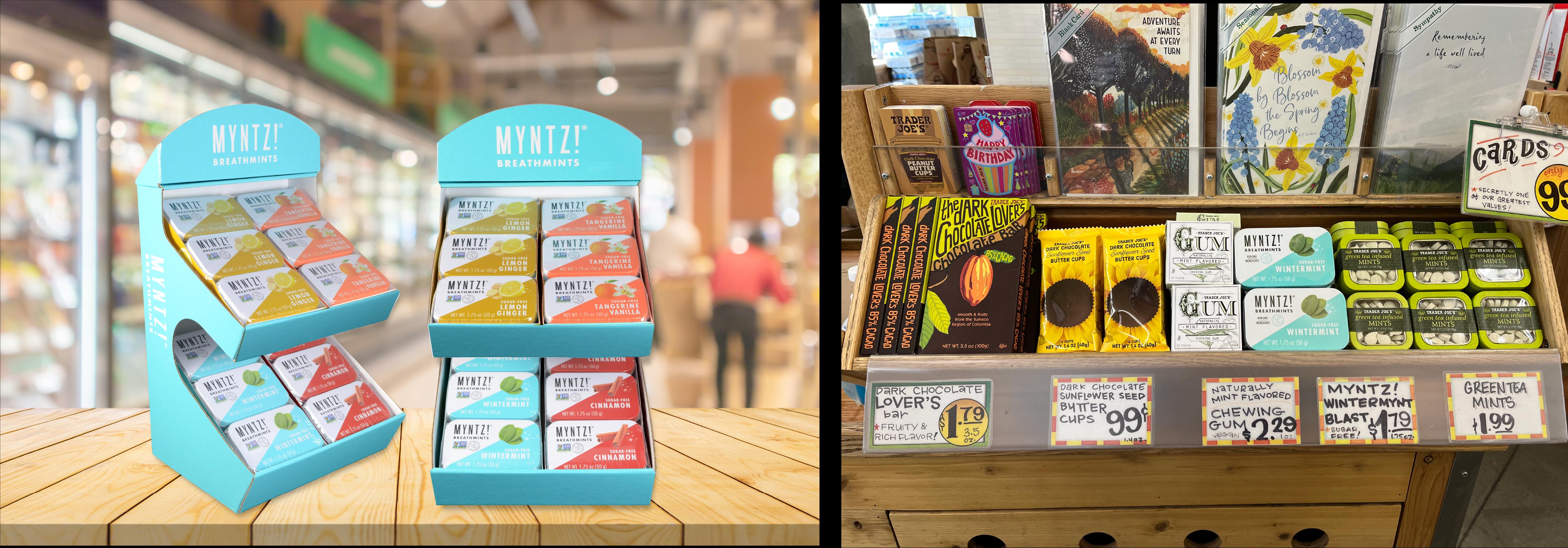
- POS Design
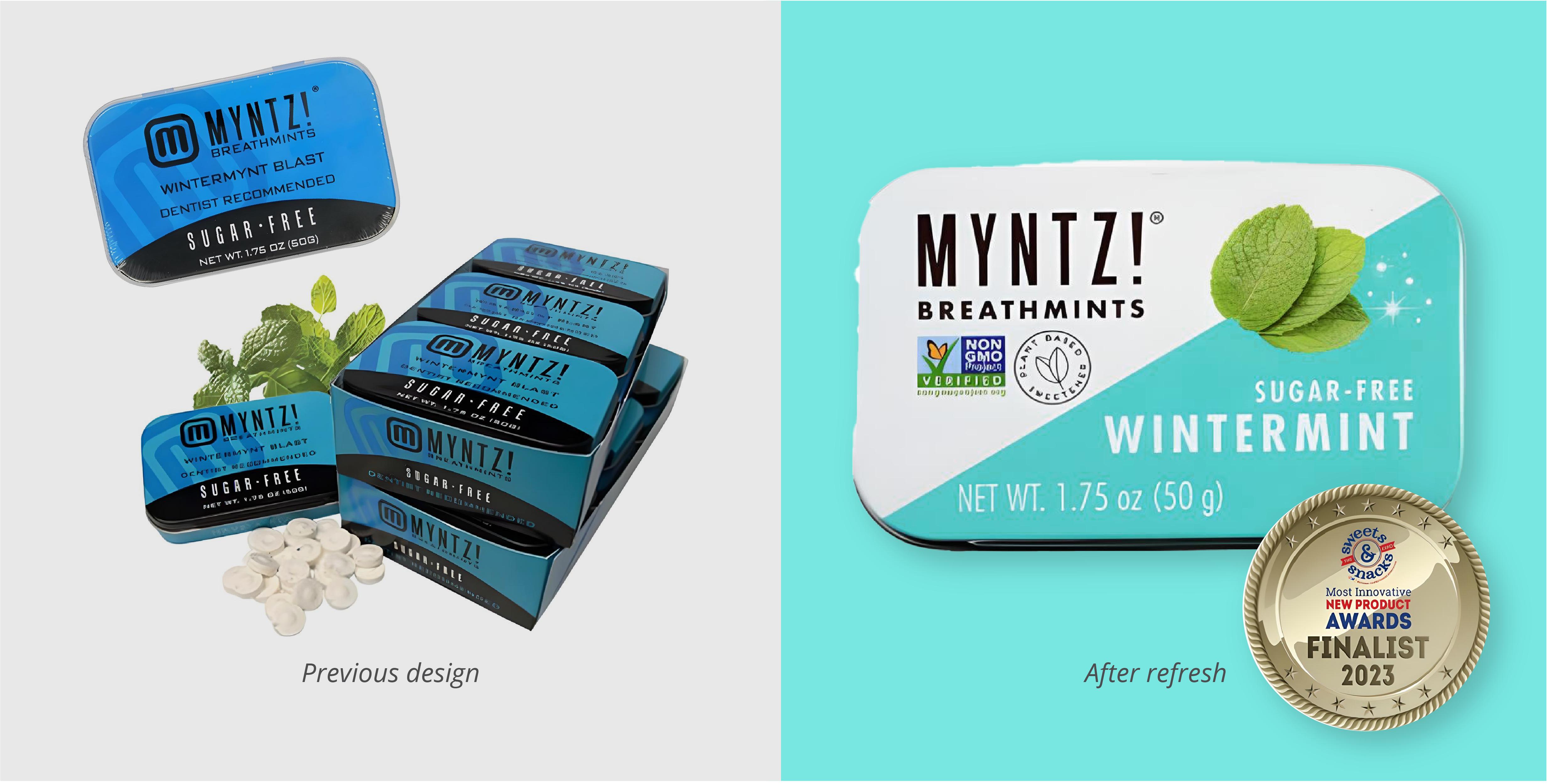
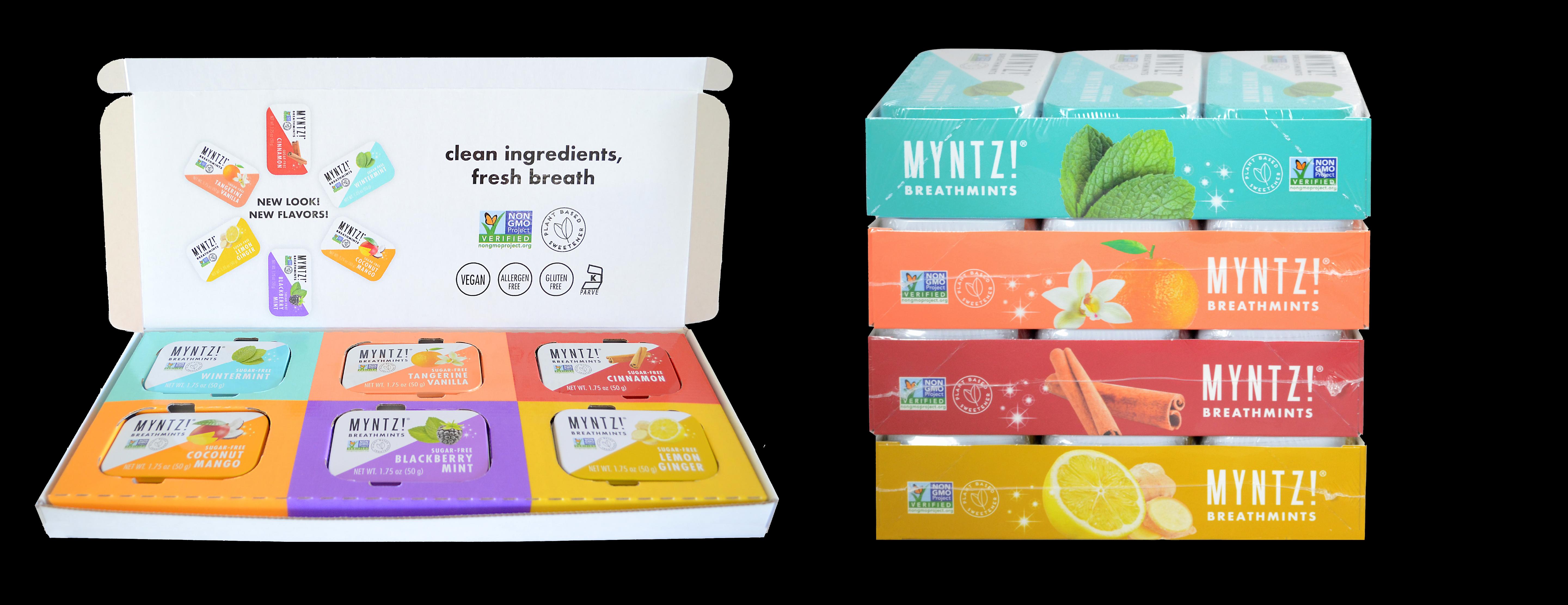
When the brand transitioned to cleaner ingredients, I saw a chance to revitalize its visual identity. I modernized the packaging and logo design to reflect this change while supporting the introduction of new flavors. This case study showcases how I helped the brand refresh its image while staying true to its market presence.
Strategy

Photography Art Direction
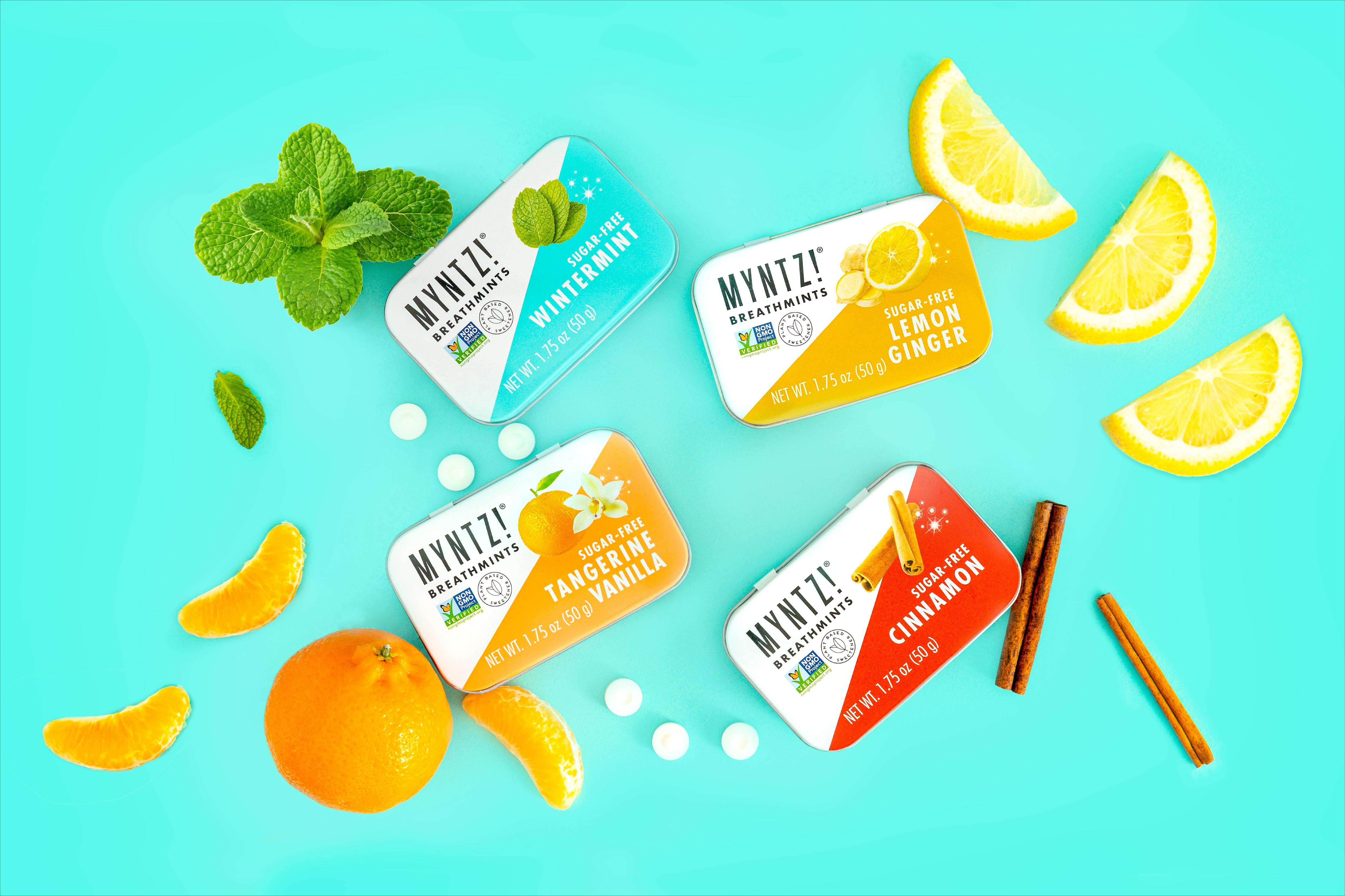
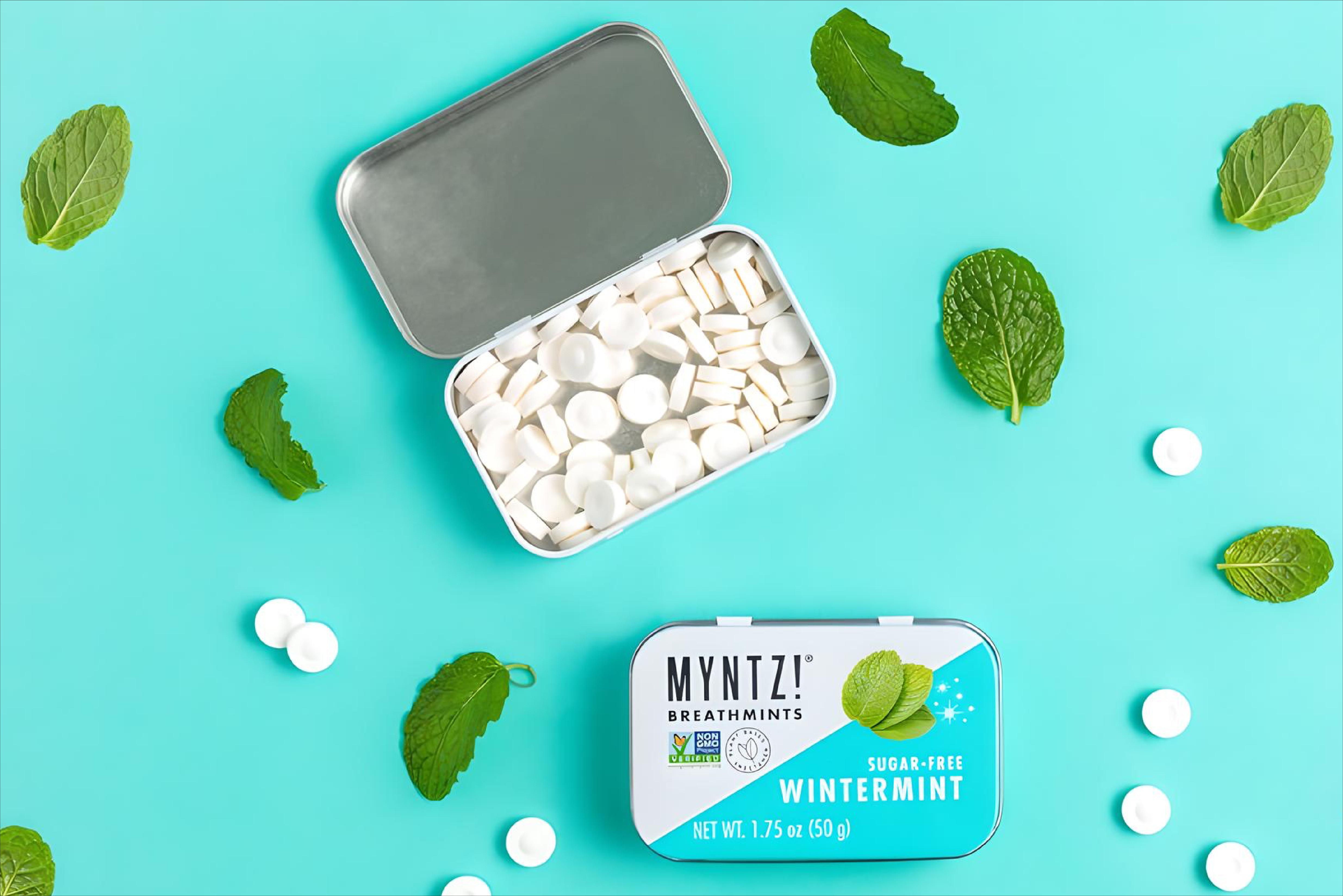
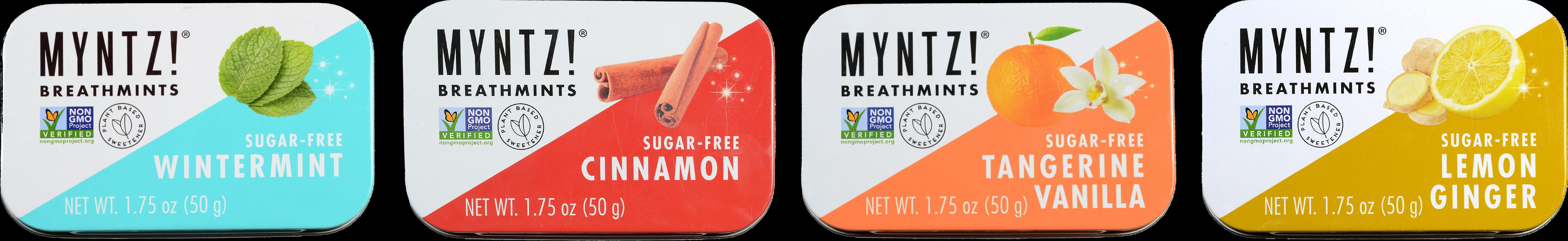
Packaging
Store Displays
Credit: Myntz! on solid blue backgrounds @Julee Ho and team